Design plays a huge role in the world of ecommerce, and can even influence whether or not a customer buys from you. Website responsiveness aside, the theme you choose has an impact on your visitors as does any design elements you include.
We’re going to be looking at some of the ecommerce design trends for 2020 from simple designs that any ecommerce shop can implement, to those a little more suited for other types of websites.
1. Dark Mode
Dark mode is something that has emerged in the last few years and was introduced by Apple in September 2019 and was also recently launched by WhatsApp in Spring 2020. But Google was the first to introduce it to their products back in 2019 from Chrome to YouTube and more
With an increasing demand for dark mode to be featured on apps and websites, it’s a design trend that will take off in 2020. Websites that are optimised for dark mode will look great but there are those that don’t quite look so good in dark mode yet. And for those who haven’t caught onto dark mode yet, Google Chrome has developed a “Night Eye” feature, which will turn normal websites dark, whether they’ve been optimised or not.
2. Soft Shadows, layers and floating
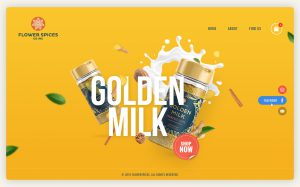
Something that’s had an increase leading up to 2020 is the use of soft shadows, layers and floating elements. Creating depth is the new thing versus a previous trend of keeping elements of your website as flat as possible.
Creating more depth on your site helps to provide your user with a better understanding of your products through more interesting and eye-catching imagery. This isn’t just limited to imagery but can be extended to text and photo-based content too. And can give a lightweight but layered feel to your design.
Credit: 99designs.co.uk
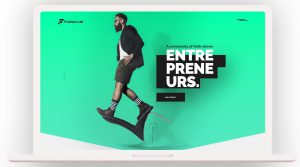
Credit: 99designs.co.uk
3. 3D Graphics
3D graphics have also sprung onto the design scene helping to enhance website experiences and brand messaging. They can offer a wide range of benefits to your site and depending on what you’re looking for that can be anything from creating your own environment, in order to improve the selling experience to activating their appetites and giving them food envy for example.
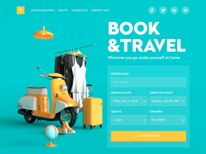
3D graphics have the ability to transform and draw in the user and also happily compliment any other elements just like the example below. Alongside colours that complement and good typography, using 3D graphics on your site can really give you an edge over competitors and bring your website into 2020 at the same time.
Credit: tubikstudio.com
4. Illustrations and Animations
Something that isn’t for every website but this agency has put their skills to good use and showcased them on their website in a really interesting way. A-0 has created animations for the majority of their website and they’ve also included music and sound effects to really immerse the user into their world.
5. Line Art
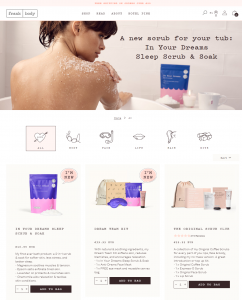
Line art is another design choice we are seeing more and more of this year. Clean and minimalistic lines to support icons like on Frank Body’s site help to create a more friendly and unique feel to the site. Accompanied by a typewriter font, this website design is perfect for their target audience and the line art style icons continue across their social media channels, providing brand consistency and recognition.
6. Typography
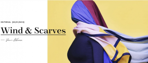
This year, we’re seeing a lot of brands breaking typography rules but, typography, in general, has stepped into the design trend spotlight as more and more people are experimenting with different types of typography and fonts.
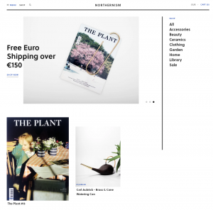
Northerism has used a simple but impactful typography on their site, in keeping with their minimalist style but has also overlaid their typography with their photography across the homepage, challenging traditional typography design. Although, the font choice does give the user a good experience on their site and the layout is clear and simple.
7. Minimalism
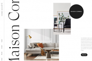
Touching upon minimalist design, minimalism has taken the reigns this year even though its popularity has grown over the past few years. However, this trend isn’t just simply minimalism design, but it’s also being mixed with maxi-typography to give depth to the design of the site.
What do you think of these design trends? Will you implement any of them on your own sites?
The post 7 Ecommerce Design Trends appeared first on Ecommerce Blog.
 from Ecommerce Blog https://ift.tt/2Q0wsDa
 via IFTTT
No comments:
Post a Comment