So, you’re building your own ecommerce website and you’re creating the main pages for your site but you’re not sure how to make the best ‘contact us’ page for your site. In this post, we’ll be talking through what you need to include, what the best design practices are and provide a few examples to give you a little inspiration.
Your ‘contact us’ page is arguably one of the most important pages on your site. Putting aside your social media channels, your ‘contact us’ is an important page to have so that customers and potential customers will be able to get in touch about any queries they have. So you’ll want to make sure that your visitors can find exactly what they’re looking for. Which leads us into our first point, what information you need to include.
Important information to include
When thinking about what to include in your ‘contact us’ page, try to put yourself in your visitors’ shoes. If they’re looking for something in particular, what kind of help are they after? Are they looking for customer support? Do they have a query? An issue with their order? These types of questions could go on all day.
So the first thing you need to include is a range of ways for visitors to contact you. Be that by phone, email, live chat, or social media as a few examples. Some sites even split out ways to contact them by the type of query, for example like Scribd who offer an audiobook service. Their queries are split up this way to help the user find what they’re looking for by taking the easiest route.
You should also include links to your social media channels. Think of your social media as a multipurpose tool; it’s used for brand awareness, content marketing but also as a way for people to communicate with you.
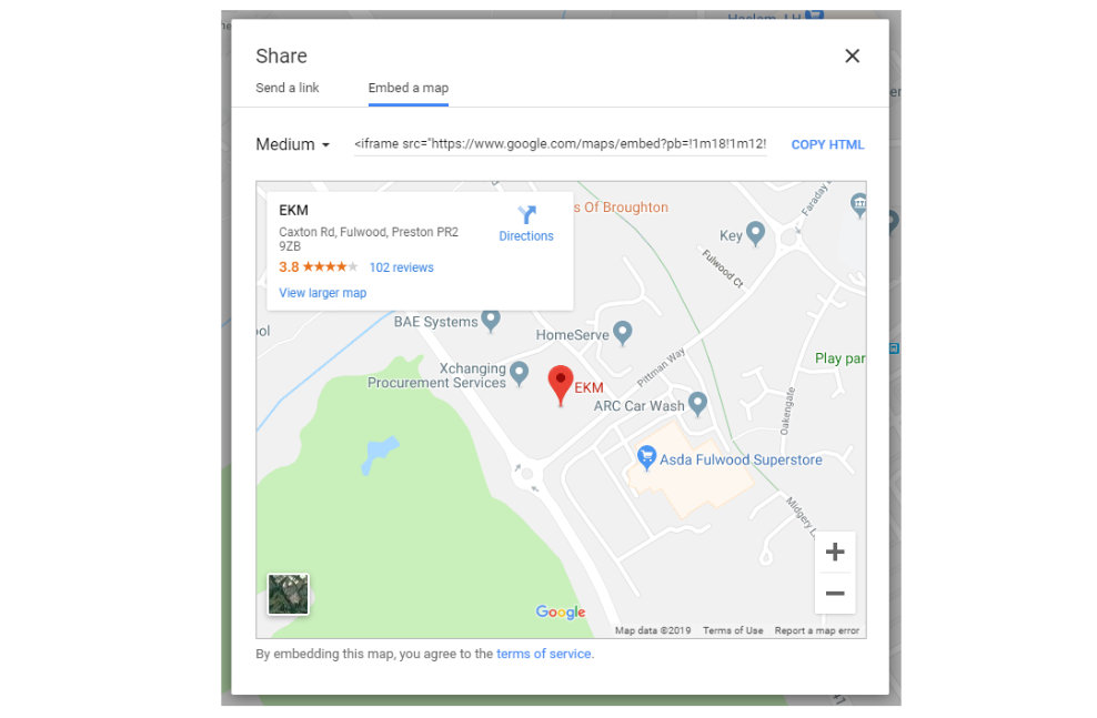
You’ll also need to include your physical store address if you have one, or multiple, including directions and a map which you can embed from Google. Simply find your premises on Google maps, click the ‘Share’ icon and choose ‘embed a map’ – the iframe code you see can be inserted into your website to display your physical store location. You’ll also need to include your opening hours.
You could just keep it simple and include a contact form on your page, but while simple, it won’t offer your visitor a quick answer to their query. Which is why you should also look at including some FAQs if you’re choosing a simple contact form. FAQs should answer your visitors most common questions. For ecommerce stores, you’ll want to include things like, “What is your returns policy”, “How can I return my item”, “Where is my order”, ” Where can I purchase a gift card” etc.
Best ‘Contact Us’ page design practices
So now we have what you need to include, let’s look at the design side of things. Most website themes will already have a template for a ‘contact us’ page, which you can use but there are a few rules of thumb to live by when creating your page.
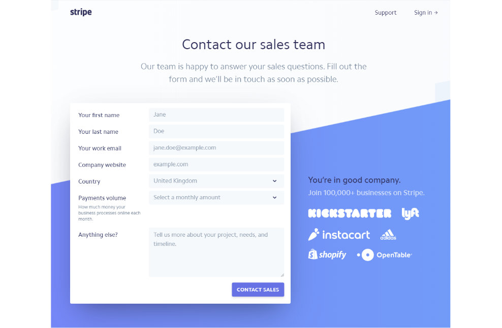
First, the page needs to be simple and easy to navigate for visitors. You don’t want to overcomplicate it and make finding answers difficult. Stripe’s contact us page is a great example of this – they use a clean design which is easy to use and they even include a list of companies that they work with – this helps to build up trust, in this case. However, what they lack is location and any other contact details, so not quite perfect for an ecommerce store.
Colin Bailey, Creative Lead at EKM says, “A well-designed contact page should direct people to the answers they need and help them ask more effective questions. It plays a significant role in improving their experience on your site. I highly recommend including FAQs on the page, which will allow customers to help themselves and ultimately reduce the number of unnecessary contacts you receive via phone or live chat”.
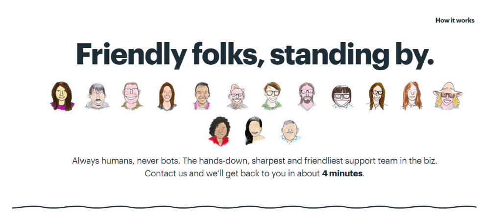
“My experience has also taught me that customers respond well to happy faces. By including the faces of your support team, you are showing your customers that there are real humans on the other side of the page. This will give them confidence in your support and generate a more relaxed interaction between you and the customer.”
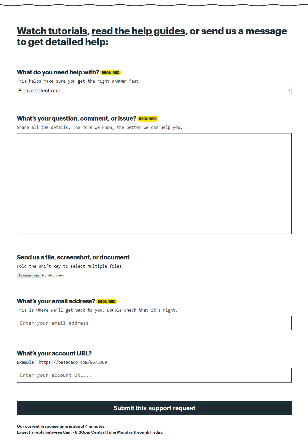
Basecamp who offer a project management service does a really good job of this. They’ve even turned their team members into friendly illustrations to keep in line with the rest of the website. They also have an interactive counter that lets you know how long you’ll have to wait for a response which is a really clever thing to do. Under this, they have a standard contact form for people to get in touch with them but they require you to include a few more details to help them get you to the right place.
Key takeaways
So, after taking advice from EKM’s Creative Lead and looking at a few examples, you might want to also take a look at your competitors ‘contact us’ pages. See what kind of things they include and what kind of design they’ve chosen.
The things to include on your ecommerce ‘contact us’ page are:
- Contact details including email address, phone number
- Enquiry form (name, email, message)
- Opening times
- Social media links
- Physical shop address, including Google Maps location (if you have one)
- FAQs
But remember to keep in mind a simplistic design if you don’t already have a template to hand. Following these best practices is a sure way to make sure your ‘contact us’ page really easy for your visitors to use and will help to make your ecommerce store look professional.
The post How to Create the Best ‘Contact Us’ Page appeared first on Ecommerce Blog.
 from Ecommerce Blog https://ift.tt/2lVJaaB
 via IFTTT


No comments:
Post a Comment